Branding a breed of cow... I love doing this kind of thing. LOGO STRUCTURE COLOUR PALETTE The palette is selected from the Droughmaster’s habitat, celebrating the place of the animal. These striking, …
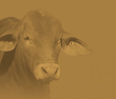

Branding a breed of cow... I love doing this kind of thing. LOGO STRUCTURE COLOUR PALETTE The palette is selected from the Droughmaster’s habitat, celebrating the place of the animal. These striking, …
One of the largest independent firms of chartered surveyors operating across central Scotland. To celebrate 70 years in business, Whyte & Barrie Chartered Surveyors underwent a full rebrand to mat…

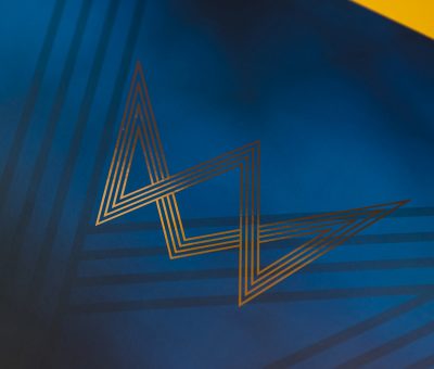
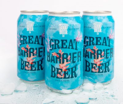
Sure. is an insurance company that could deliver fairly priced insurance to people in locations that needed it most. Places like Cairns and Townsville were people were annual home and contents insuran…
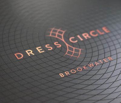
Branding for a high-end golf course property development called 'Dress Circle' launched by a leading property group in Australia. LOGO CONCEPT The logo uses curved overlapping lines that spell out ‘DC…
PHOTOGRAPHY STYLE…
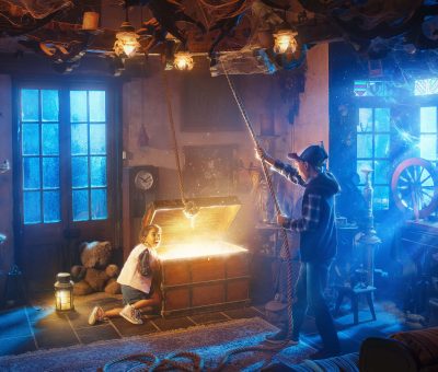
THE LAUNCH THE PAINTING…
Brother & co collaborated with award-winning photographer Damien Bredberg to bring the concepts to life.…
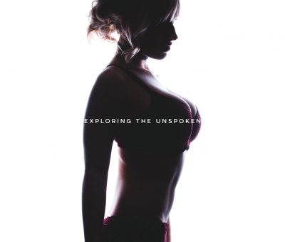
Branding for an online community and future store. This new venture is very open-minded when it comes to the sexual world. Cherry & Spice is a safe space for judgement-free sharing of thoug…
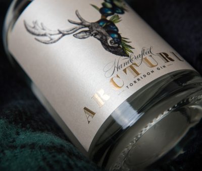
HANDCRAFTED ARCTURUS TORRIDON GIN. Full style, identity, packaging & advertising design. This gin was conceived from foraging local Highland botanicals. The design includes the iconic red deer sta…
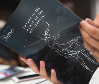
The latest edition of the annual Torridon Magazine, the foiling of the cover really set off a very nice print job. The magazine was sent out to over 6 thousand people worldwide and received very posit…